57-84

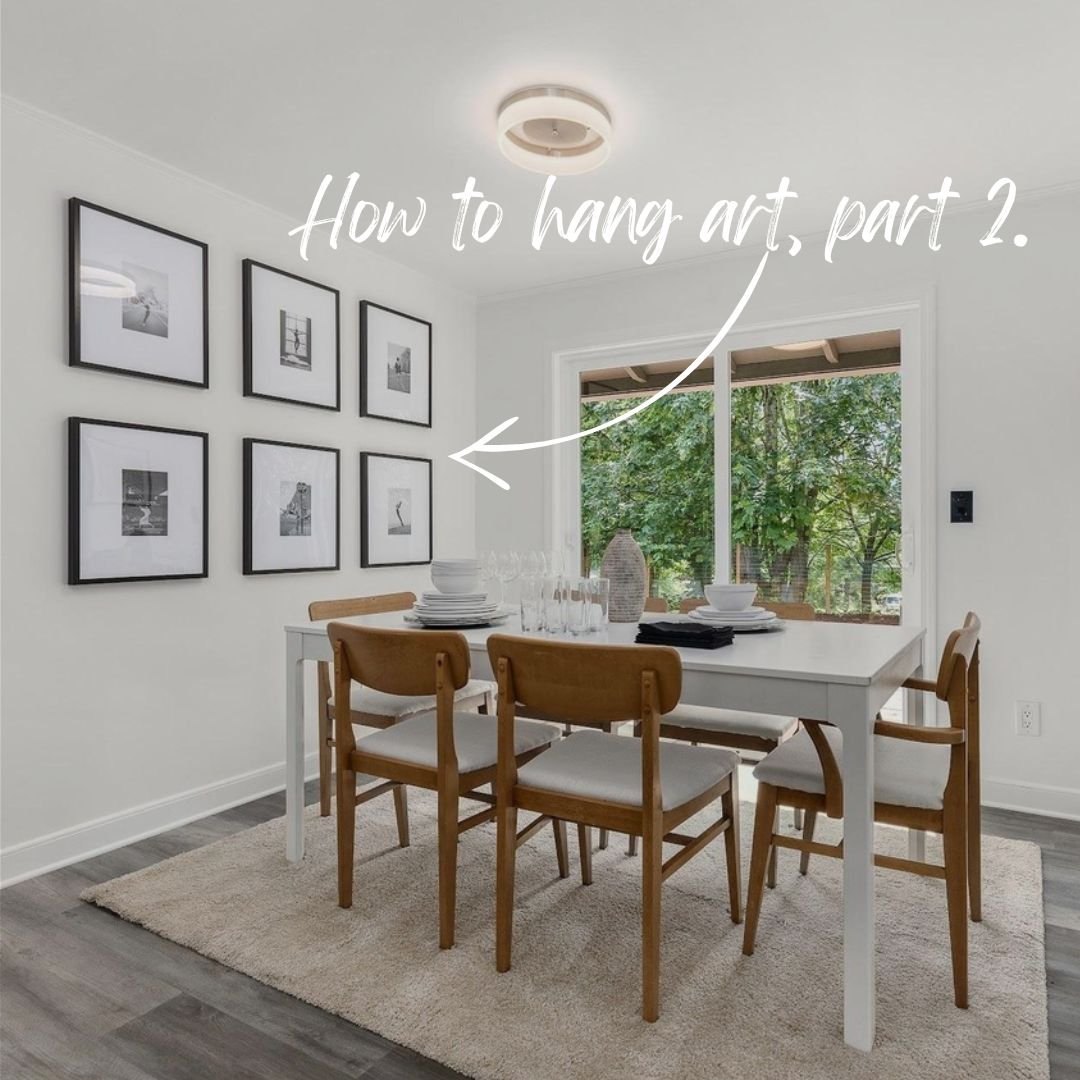
HOW TO HANG ART, PART 2: THE ART GRID

At Spade and Archer Design Agency we have made grided artwork a main stay. The art grid uses a few of the most basic design principles like rhythm, repetition, and scale to bring out the beauty in even the simplest piece of art. When hanging a grid use these guidelines to insure a successful adventure. 

1. Figure out how many pieces you want the grid to have then buy that many of the same frame. If the frames are all the same, the mats can be cut at different sizes to accommodate the art. We like to use artwork that is all different but on one general theme like cars, surfers, or black and white landscapes. 

2. Determine your spacing and use it for both the horizontal and vertical. If there is a six inch gap between two pieces next to each other, there should be a six inch gab between two pieces above and below one another.


3. Pretend that all the pieces combined make one piece of art. Then layout the outer edges of that piece both centered on the wall horizontally and 57” above the finished floor  to the middle of the piece vertically

Get your instant home staging price now by clicking here.

WHY DOES THE SOFA SIT AWAY FROM THE WALL?

At Spade and Archer Design Agency our goal is to try to make every room look as big as possible while still having a human scale.

While we will often place a sofa near a wall, we will nearly never press it up against the wall, unless the room is so tight that we have to. We try to leave at least a 6” gap between the wall and the back of the sofa to make the space look a bit more relaxed. The last thing we want to see “perimeter staging.” It’s that thing in spaces where it feels like all the furniture was placed in the middle of the room, the room was spun really fast and all the furniture flew to the outer walls and stayed there. Furniture does not need to be anchored by a wall, let it breath, let it live, let it float.

Get your instant home staging price now by clicking here.

HOW TO HANG ART, PART 1: SIDE-BY-SIDE PAIRS

Home staging with Spade and Archer Design Agency can be a bit different than interior design. With home staging we have to make sure the house is the star and the furnishings are back up dancers. The staging should be good, but it should not outshine the house itself.

When hanging a set, be sure to space them equal distant away from either each other or from the object they are splitting. In this case they have been hung with six inches on both the right and left side and at the same height as each other. We use the museum standard of hanging the middle of the art at eye level or 57” above the finished floor. 

One of the biggest mistakes we see when hanging pairs of art is to hang out 5 or 6 inches higher than the other. While there is a time and place for this (we will explore this in hanging art in staircases) this rule should almost never be used in flat rooms. 

Get your instant home staging price now by clicking here.

What's With the Buffet Set Up?

At Spade and Archer Design Agency we do things a little differently. It started with leaving calling cards like our vintage radios and culminated in an entire revolution of our industry with things like Guaranteed Home Staging® "Pay-At-Close" home staging and our instant pricing, and booking tools. 

One of our innovations along the way was the "Buffet Set Up." Many stager "set" the table with place setting of dishes at each chair. We found this look to be too contrived and predictable. It felt forced and fake. The last thing we want is for our buyer to feel like they are being bamboozled into buying a house. 

So for a few months we tried only putting a single center piece on our dining tables. We found that this left the tables looking like a massive empty void in the listing photos. The listing photos are the first thing a buyer sees, so vacant empty dining rooms in the listing photos was simply not going to cut it. 

Our compromise was to stack the dishes as if the table was about to be set. A nod to interior design photo shoots and giving the photos a bit of interest without being overwhelming and predictable. We called it the "Buffet Set Up" and it has been wildly successful. 

Under each of the top dishes is a sassy note asking folks not to set the table for us. It explains that we left the dishes this way on purpose. We find sellers get a laugh out of the note and understand why they hired us the first place. 

Houses staged by Spade and Archer sell for more money and faster than the general market. So what are you waiting for?

Get your instant home staging price now by clicking here.

How to Get Inside your Buyer's Head

When it come to preparing a property for market it is vital to remember that the house is no longer your home, rather it is a product being placed on the market with a potential buying demographic. You have now become a small business owner and you must design your product to appeal to the largest buying demographic possible. 

So often we work with sellers who say things like “I love modern furniture and I hate the color orange so be sure to stage the house the way I like it.” 

We do our best to listen and then gently explain that “Of all the people in the world who might buy this house, you are not one of them.” As home stagers in either Portland Oregon or Seattle Washington, we are designing not for the seller, but for the buyer. Based on the location, size and style of the home we can roughly determine who the buyer might be and design the home to attracted the largest buying demographic possible. If we are instead designing the house for a person who no longer wants to live there we will, most certainly, miss the mark. 

As humans, we have two thinking processes, logical and emotional. When we search on the internet for the type of house we are looking for, we use the logical side of our brain. “It must have 4 bedrooms, 3 bathrooms, a back yard, in my price range and in a location where I want to live.” Once we find a house we think might interest us, we type the address into our phone and drive there. That is when the logical side of our brain turns off and emotional side takes over. 

The emotional side of our brain is very fast at making decisions. It says things like “Lion, run!” Where as the logical side of our brain is much slower but also better informed, it says things like, that lion is taxidermy and can’t hurt us. As you can see, both sides are useful, but we must understand how these two sides work together in order to understand how a buyer views a house. 

The logical side of our brain can hold up to 5 bits of information at any given time, it’s why our phone numbers are set up with three digits - three digits - four digits, it helps us remember them more easily. The emotional side of the brain, however, can only hold one piece of information at a time. When a buyer is viewing your property, you want them to think about themselves living in that property the entire time they are there. Anything else that might grab their emotional attention might take away from the single task at hand. It could be something religious, or political or even a simple vice that suddenly grabs their emotional attention away from the house and at that point, you have lost them. 

I once had a client tell me a story about a giant bear skin rug that filled the primary bedroom of a house. She went on and on about how much the potential buyers had made a fuss over it, discussing it multiple times throughout the day while they were on tour. I asked a simple question “What did you think of the house?” 

Her answer was “I don’t recall, none of us were paying attention at the time.” She had heard me talk about this kind of thing during site visits before and said, “It really was true, we really reacted to that bear skin rug.” Even more importantly they failed to react emotionally to the house at all. Needless to say, they did not buy the house nor the rug. 

A religious effect could be anything from a crucifix to a Buddha, to a mezuzah. It does not matter what religion the potential buyer is or is not, if it draws their emotional attention, the object is doing you, the seller a disservice. 

A political effect is anything that puts us into categories of us vs. them. It could be a sports poster or banner, a MAGA hat, a book by Hillary Clinton, a national flag, American or otherwise. I know for a fact that these things can all be very emotional because I have had people get very angry with me when I asked them to put them away for showings at their house. The very fact that it pushed them to anger was proof enough that these types of items should not be displayed IF our number one goal is to sell the property. 

Emotional vices are pretty easy to define these days. They fall into some very simple categories, drugs, sex, alcohol, nudity, tobacco and guns are all thing that have no place being displayed in a property being marketed for sale. While their presence may draw the attention away from a house, their absence never will. 

We also never stage with anything that has fur. Because we live in the Pacific Northwest, we have a high concentration of vegans and vegetarians, along with animal rights activists. When it comes down to it, items with fur, especially taxidermy can be very emotionally evocative even for folks who do eat meat. Nobody will ever walk into a house and say, “No faux fur or cow skin rug? I hate this place!” But they could walk in and see the skin of a murdered bovine and say to them selves, “This place just isn’t for me.”

We are headed into a transitioning market, one that will be tougher for sellers to get houses sold. Choosing the right team to help you prepare your property for market will make a huge difference, choose wisely. 

Get your instant home staging price now by clicking here.